Lorier Watches
Neptune
By: Marcos Santana • Watch Exposure
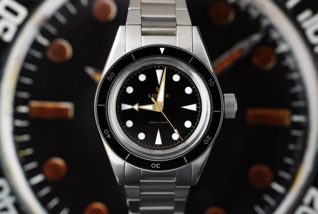
What do you get when you combine some of the favorite vintage divers watches in history such as a Submariner 6538, Titus Calypsomatic, and Seamaster 300 CK 2913? You get a very interesting and solid design that surely will make dive watch lovers and WIS extremely happy. The Neptune, the debut model of newcomer micro brand Lorier Watches (pronounced Loryé) offers a lot of what we love about the vintage classic divers while holding its own identity.
Lorier Watches is a two person operation, a husband and wife team as a matter of fact, Lorenzo and Lauren Ortega. Being vintage watch and adventure lovers themselves, they founded Lorier Watches, inspired by the the good ol’ days where people only had that One watch. The One watch that could be taken everywhere and used in every occasion, a watch that could grow old with the owner. They didn’t want to pay homage to just one specific watch, but pay tribute to the ethos and spirit that these iconic pieces of wrist watch history were all about.
The name Lorier is a derivative of the French word for “laurel”, as in a Laurel tree (one of my personal favorite trees). The Laurel is a symbol of victory, triumph and honor. The name is also the root word of Lorenzo and Lauren’s name. Lorenzo grew up speaking French in Geneva, so they thought it was fitting. I am a fan of little details like this because it makes the experience more personal and that’s what Lorier Watches want to offer with the Neptune, a more personal experience with their watches.
Now that I’ve covered a little bit of the backstory of this new up and coming micro brand, let’s dive into the watch (no pun intended).
The Neptune Watch Exposed
I was very intrigued prior to receiving the watch. After seeing some pictures on the website, and a few correspondences with Lorenzo, I decided to go with the gilt dial prototype for the purpose of this review. I love a well executed gilt dial and from what I had seen, this one looked good to me.
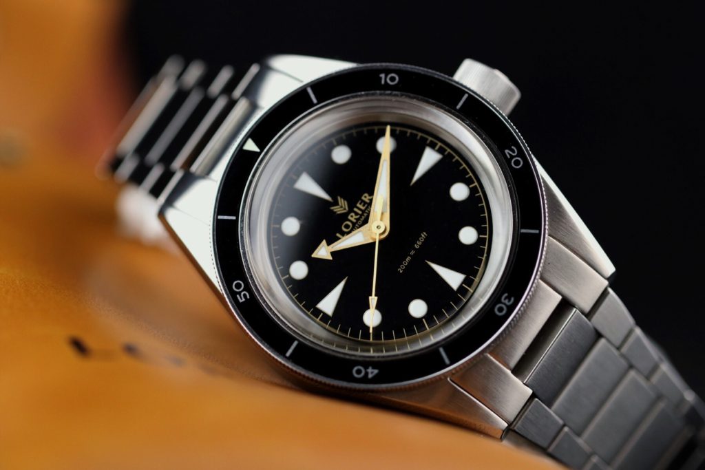
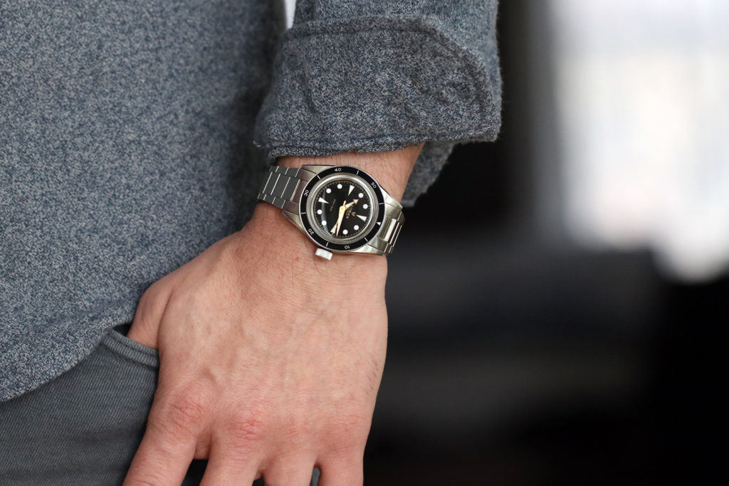
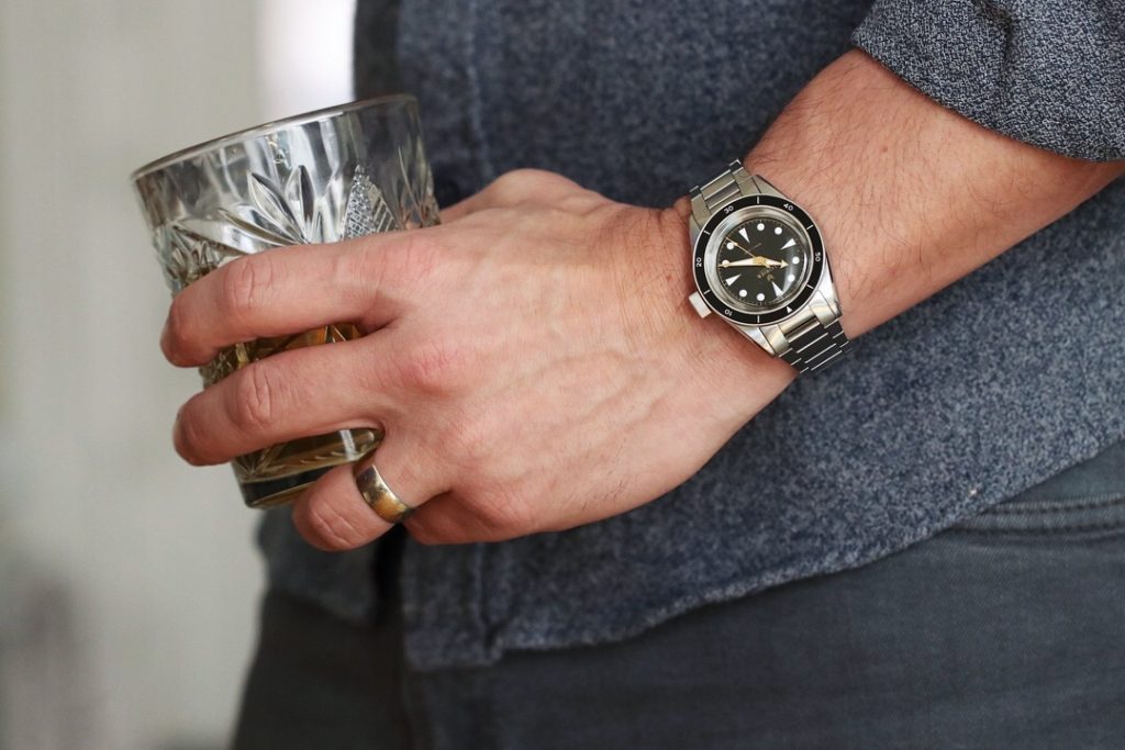
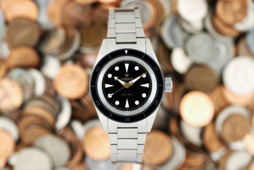
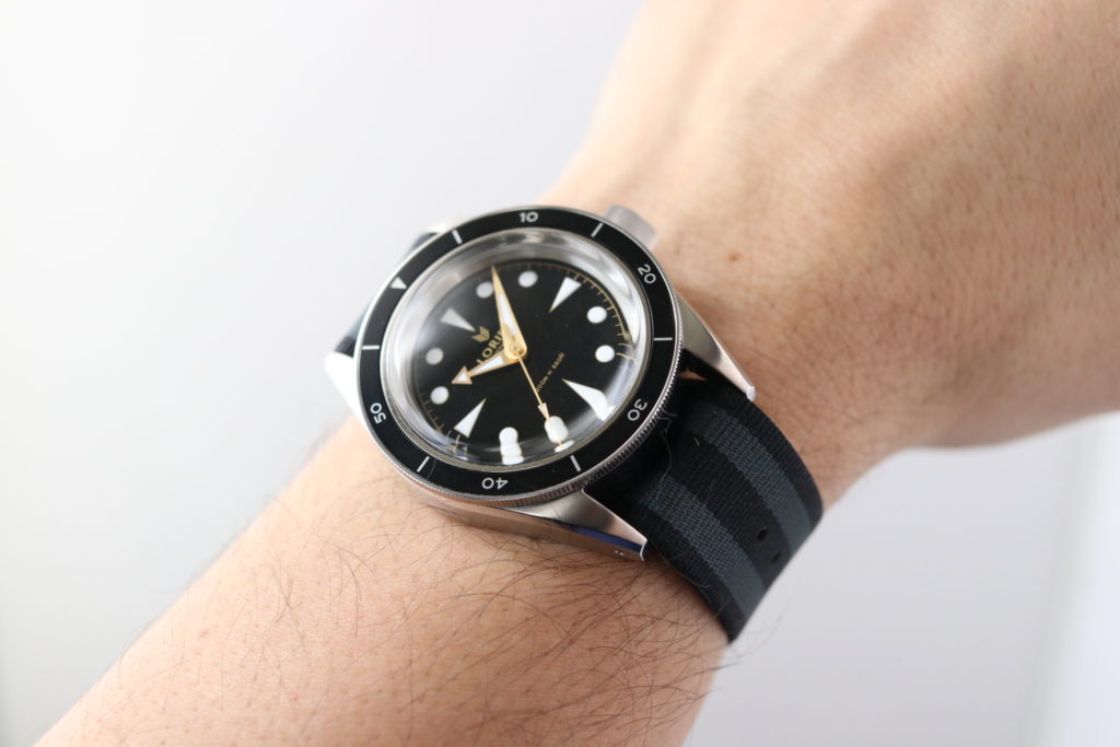
The Neptune features a 316L Marine-grade stainless steel measuring. At 39mm width, 48mm lug to lug, this watch will fit perfectly on any size wrist. The domed acrylic crystal adds to the vintage vibe of the watch, but also adds to the height of the watch at 14mm height. The height didn’t bother me at all while wearing it. It fit nicely under my shirt and jacket. Although many watch enthusiasts may prefer a sapphire crystal, to stay true to the vintage feel of the watch, Lorier Watches went with acrylic. To be honest, that is the only way I would’ve done it as well.
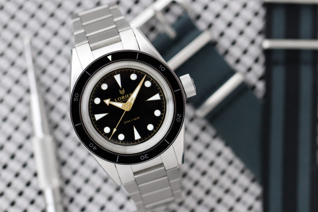
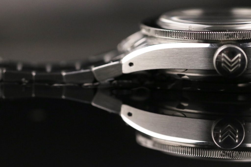
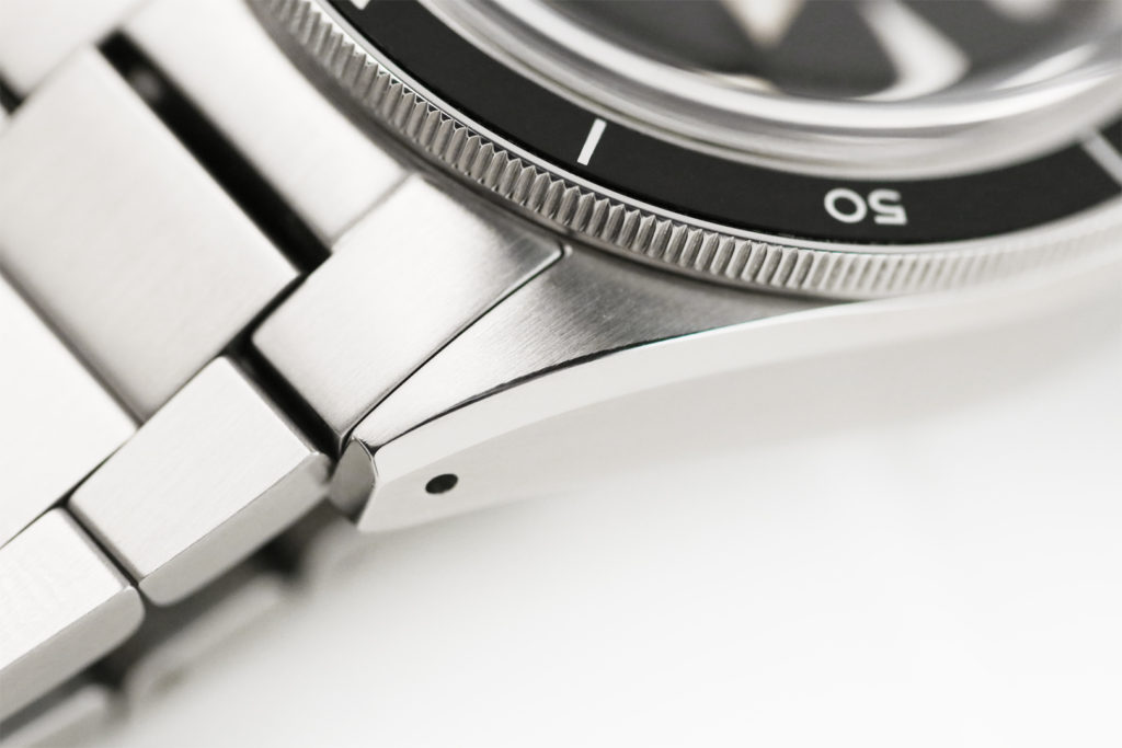
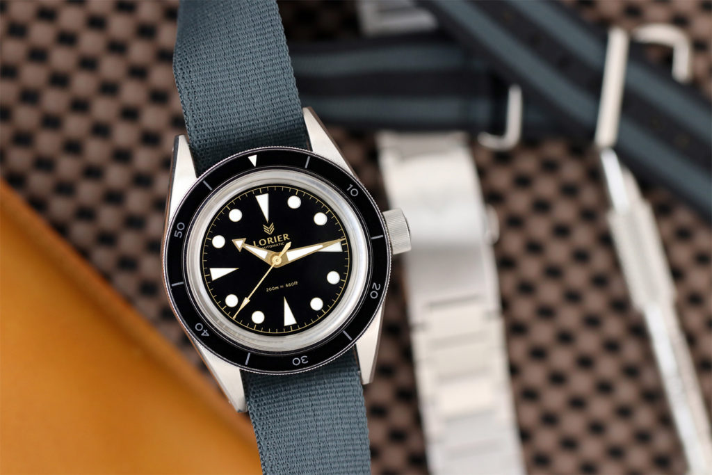
The case mostly has a vertical brushed finished with polished chamfered edges on each side. This detail adds so much depth to the look of the case, specially when the light hits it at different angles. Following the side curves of the brushed case, we reach the 20mm drilled lugs for more vintage goodness and easy strap swapping. The curved lugs design enhances the comfortability on the wrist either on the phenomenal OEM bracelet, a NATO or a leather strap (Yes, I like leather straps on diver watches). Another cool little detail of the design worth mentioning is how the inner slope of the lugs match the outer slope.
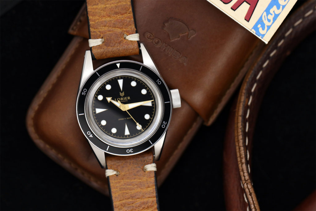
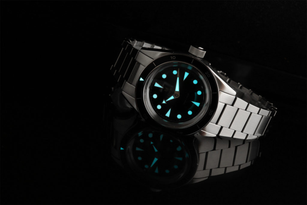
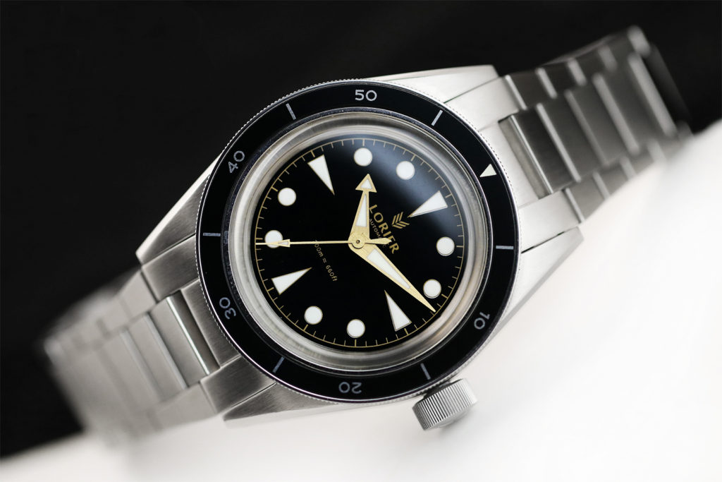
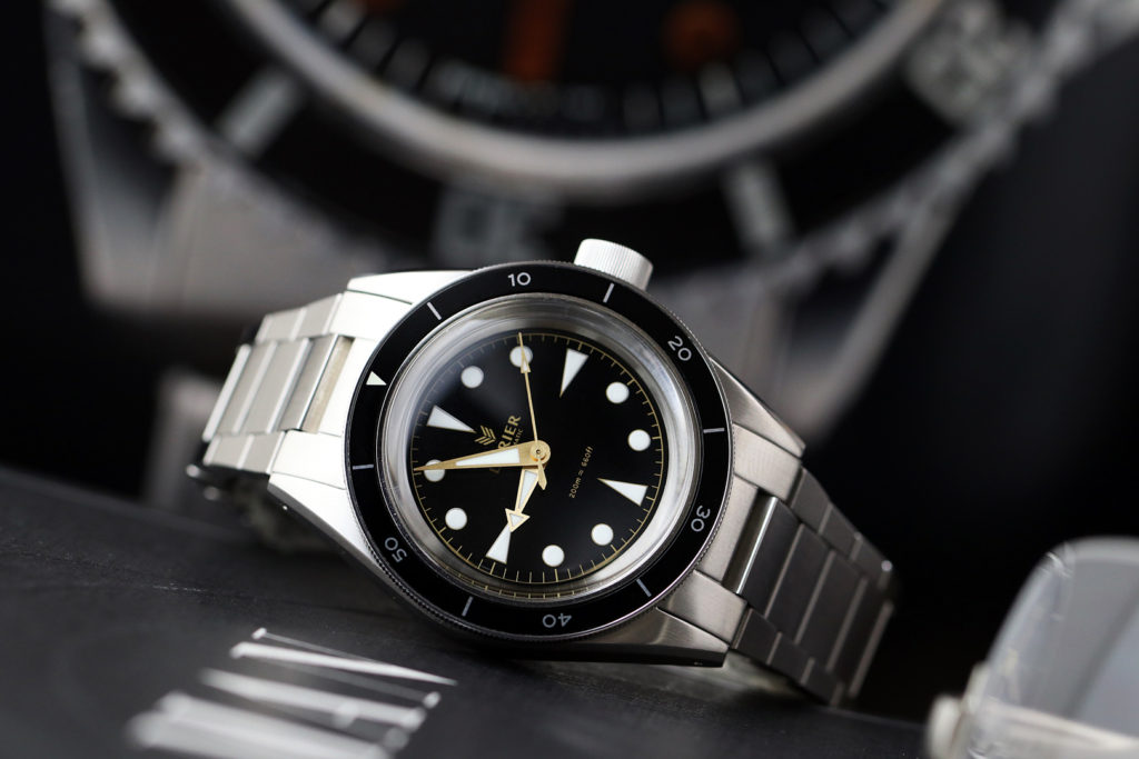
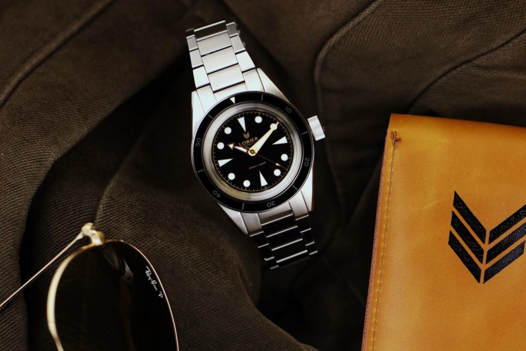
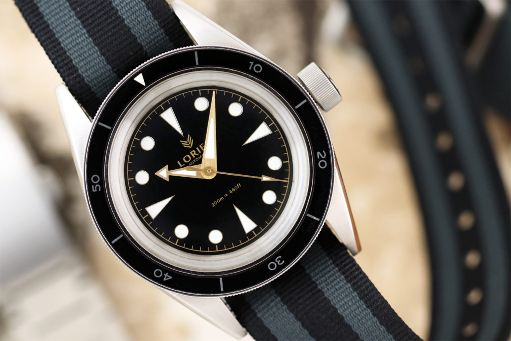
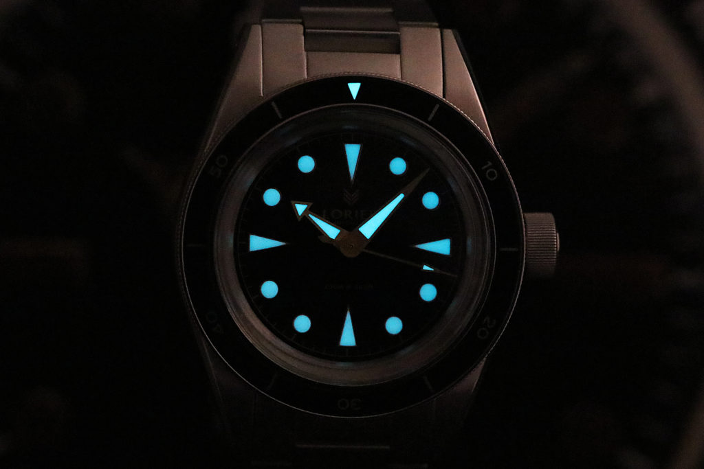
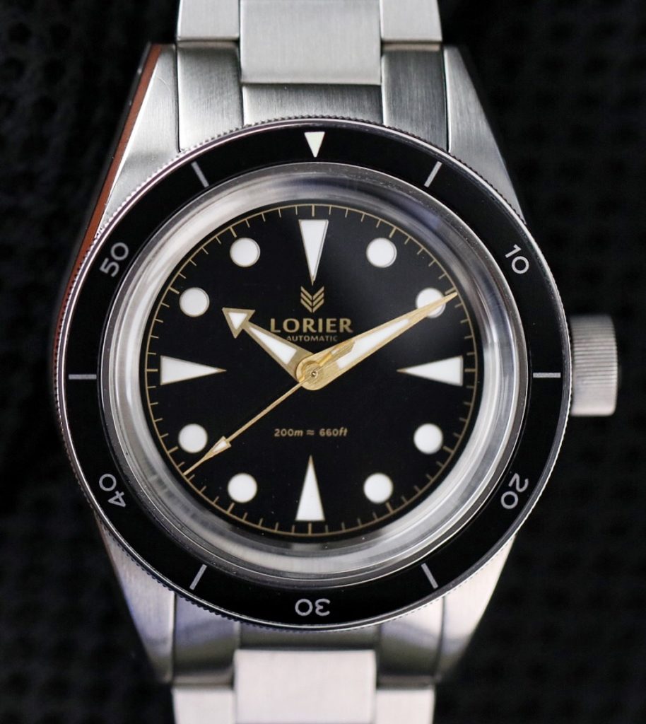
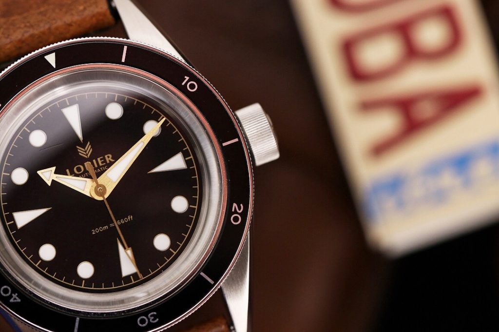
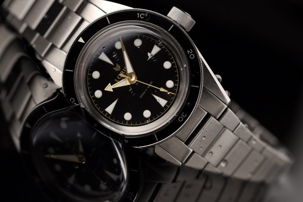
Extending the brushed finish to the center of the watch, the brushed rehaut frames the gilt dial in a harmonious way. As for the face of the watch, you can see the influence of the recognizable Submariner style dial and the Seamster 300 bezel. However the Neptune does it in it’s own way. The coined edge, 120 click unidirectional bezel is solid. Even on this prototype, there is no play what so ever. It has the right amount of resistance and grip for easy operation. The aluminum bezel has a lumed triangle at 12 o’clock and thin Seamaster-like numerals that adds refinement to the look.The dial has elegant enamel finish with equally elongated triangles at 3, 6,9,12. To keep the vintage flare, Lorier Watches opted for printed round hour markers with thin gold/gilt edges featuring Swiss Superluminova BGW9 dots. I personally would’ve liked a stronger lume though, it didn’t last as long as I like, but that is’t typical of BGW9. However, this is a prototype and I hope the final production has a stronger lume application.
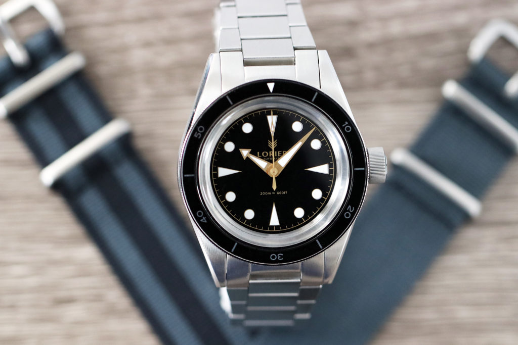
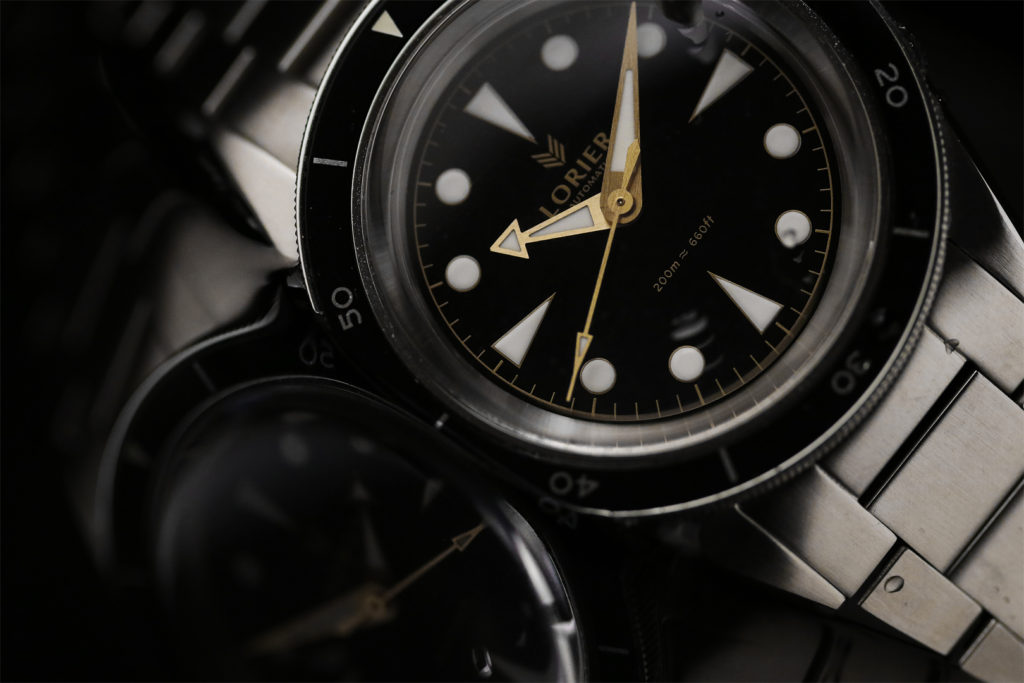
The text on the dial is executed in a very well balanced way. At 12 o’clock we see the the Lorier Symbol, an abstract representation of the Laurel tree leaves (c’mon, I mean how cool is that), the name Lorier and the automatic underneath. I am a fan of well thought out brand graphics and Lorier Watches knocked it out of the park in my opinion. At six o’clock we see the water resistance specs 200m = 660ft. Bordering the dial is the gold printed minute/seconds ring larger and thicker batons marking the hour minutes.
There are three great design elements that stand out to me on the Neptune and these are the hand set, the crown and the bracelet:
- Hands: I must confess that I wasn’t keen on the hands when I first saw the picture; however once I saw it in person, it became one of my favorite features of the watch. Inspired by the iconic vintage Seamaster 300 hands shape, the gilt hands on the Neptune have a gold brushed finish that have a brassier finish, and they look fantastic. Note that the Gilt dial features the gold hands while the Black and Blue version have brushed stainless steel hands. To keep a cleaner look, and to have a more original approach, the tail of the hands are rounded. The slightly oversized hands are legible at all times.
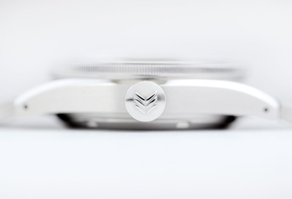
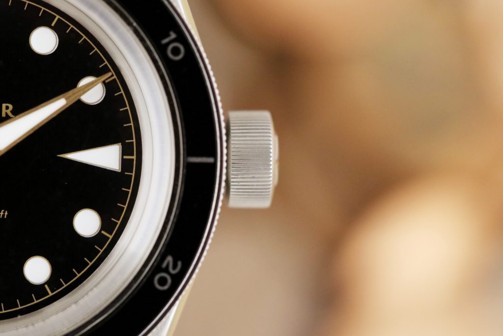
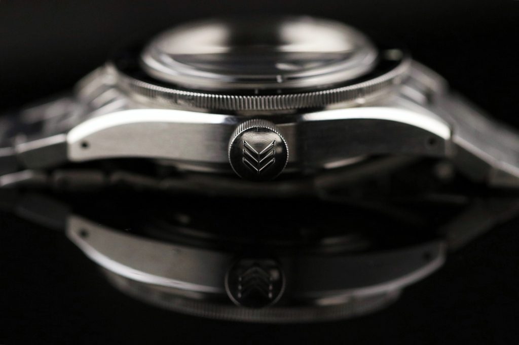
- Crown: To me, an oversized crown is one of those elements that I wish all vintage dive watch designs would consider more often. Not only does it make the design more true to it’s roots, it makes the design stand out, and it makes the operation of the watch a lot easier. The crown has a smooth screw down feel, and the very cool Lorier symbol is engraved. I was told that the production run will have a better polished finished on it.
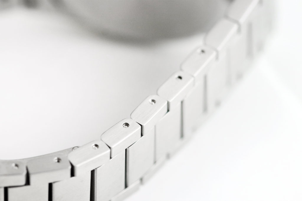
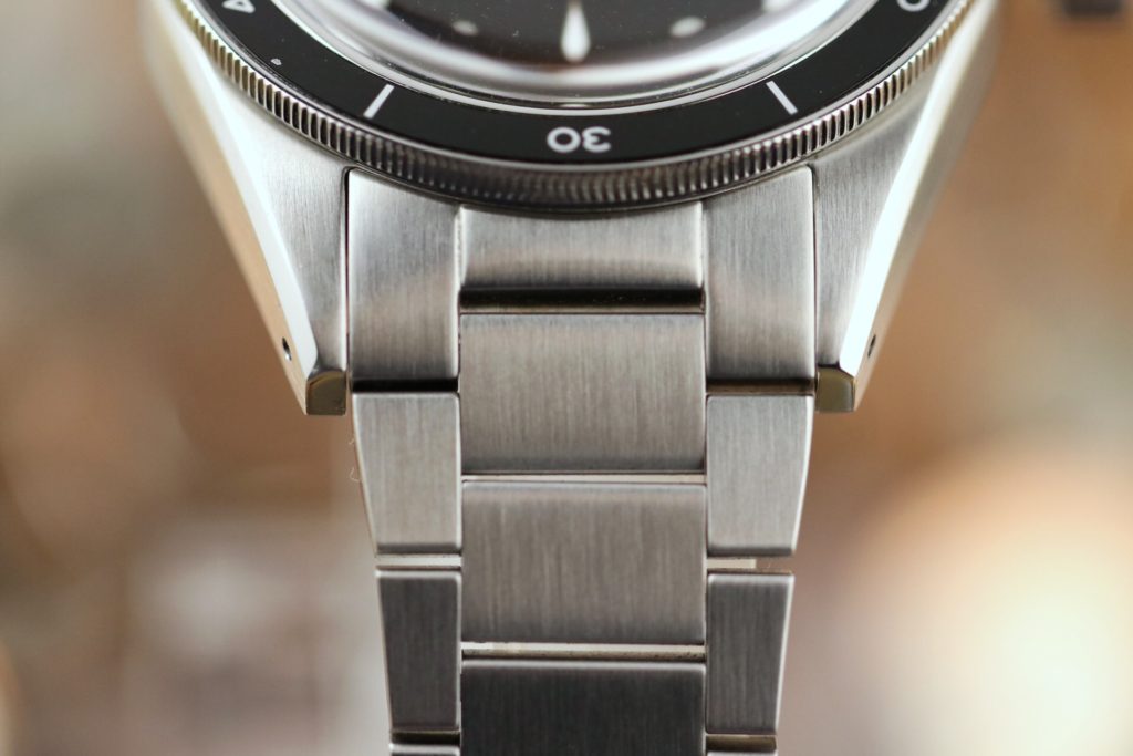
- Bracelet: This is an element that in my opinion will feel like you are getting way more than your money’s worth. Lorier didn’t want to settle for a standard oyster bracelet, so instead, they decided to design one from their first watch release. The links are flat like the ones you would see in old Omegas. This not only adds comfortability but gives a lot of smooth surface for the light to play on. I have to confess that I am not a bracelet guy, but this bracelet is phenomenal. It is extremely comfortable and at times I forgot I was wearing a bracelet. Each link is fully articulated, so the bracelet can essentially fold on itself. It’s lightweight so it feels vintage, but all the links are actually solid, so it won’t stretch over time. About 90% of the links are removable (drilled pins) which it can fit any wrist up to 8” diameter. A deployment clasp with the stamp of the brand’s logo finishes the vintage look. At this price point, I’ve never seen a bracelet so well executed.
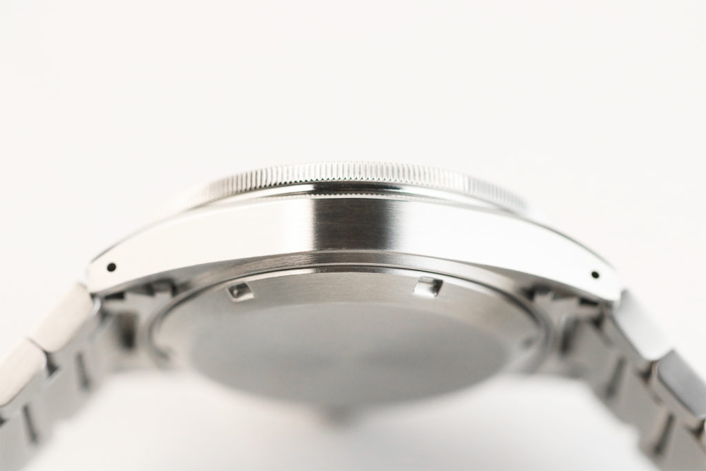
Powering the Neptune is the venerable work horse and micro brand favorite, SII NH35A Automatic movement. This movement, beating at 21,600bph, has a power reserve of 41 hours and it’s decorated with 24 jewels. This has become a standard movement on affordable watches due to its reliability, easy service and strong performance. The movement is hidden on a sterile, brushed stainless caseback. I would’ve like to see some design on the caseback, but I understand that Lorier wanted to keep it as pure a vintage watch as possible, and it definitely works. After all, the beauty of this watch is all in the front.
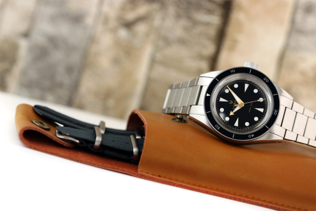
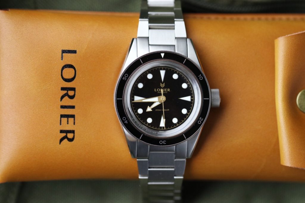
Even in the packaging, Lorier Watches put good thought into it. Instead of a typical or overly expensive watch box that is just for looks, the watch comes in a multifunctional, vintage inspired genuine leather pouch that can serve as a travel case for the watch. Or, if you’re already wearing the watch, the packaging also fits a pair of glasses/sunglasses. It also has the fantastic Lorier logo stamped. Have I mentioned how much I like the logo yet?
Final Exposure
I have to say that upon receiving the package I was more than surprised-the watch is just simply gorgeous. At first sight, you can tell they put a good amount of thought and effort into the design. The Neptune has an interesting familiarity to it, it is a watch that screams vintage; however upon close inspection, this watch offers so many original details that takes it away from being a straight up homage watch. The case design, the dial, the crown (Oh man that awesome oversized crown), the bracelet (superb), the hands- everything just works cohesively into one great looking watch.
The Neptune will be released in three different variations: Blue, Gilt and Black. Preorders are open now at $389, for an estimated May 2018 delivery. Lorier Watches is offering a free NATO strap with the preorders. At this price point, the Neptune is competing with other watches that might offer a sapphire crystal/exhibition caseback, among other favorites, but Lorier Watches has accomplished their mission in offering a vintage inspired watch, with vintage specs, with a very solid execution at an affordable price. If this is the company’s first release, I am so looking forward seeing what they have up their sleeves in the near future.
Visit https://www.lorierwatches.com/
Follow me on IG: @Watchexposure for more watches Exposed
https://www.instagram.com/watchexposure/

Good review of an interesting model. Love the bracelet and dial/hands/case design but I’m not entirely sold on the slightly OTT crown, which sticks out more than I would prefer. I might have also preferred a Miyota 9015 for the price even if the NH35 is a perfectly commendable workhorse. Note to reviewer: jewels don’t merely “decorate” a movement but play an important functional role.
Thank you for your comments and for your feedback.
brilliant review
Thank you